Website Re-Designs:
Before and Afters
Wells Street Spa
Our redesign of the Wells Street Spa website was all about elevating the brand’s digital presence to match the serene, high-end experience clients expect from their visits. We began by understanding the spa’s identity: calm, welcoming, and luxurious. From there, we streamlined the site architecture, introduced a softer, spa-inspired color palette, and incorporated elegant typography and imagery that reflected the space and services.
The result is a visually refined and easy-to-navigate website that truly captures the essence of Wells Street Spa. It makes every visitor feel like their journey to relaxation has already begun.


Fox Nahem
For a design studio as distinctive and refined as Fox Nahem, their website needed to be a reflection of their unmistakable aesthetic and the deeply personal approach they bring to every project. Our redesign process began with a deep dive into the studio’s philosophy: warm modernism, bold textures, and a curated, lived-in luxury. We focused on creating a digital space that felt as tailored and timeless as their interiors, blending high-impact visuals with subtle motion, intuitive navigation, and a gallery-like presentation of their projects.
The new site feels elevated, editorial, and unmistakably Fox Nahem, offering visitors a richer look into their world and a seamless way to explore the artistry behind each design.


Kate Clark
Kate Clark’s work blurs the line between art, nature, and the human experience. It is powerful, provocative, and unforgettable. Our design process centered on contrast: clean, minimal frameworks that let the art speak loudly. We restructured the site for clarity and flow, giving each piece the space it deserves while building in context, through thoughtful typography, subtle animation, and a narrative-driven layout. Every detail was chosen to enhance the emotional experience of encountering Kate’s work online.
The result is a striking new site that mirrors the intensity and elegance of Kate Clark’s vision: immersive, powerful, and impossible to ignore.


Corporate Art Group
Corporate Art Group transforms workspaces with curated, impactful art, blending aesthetics with brand storytelling. We approached the redesign with a focus on clarity, creativity, and bold aesthetic choices. Through a cleaner layout, modern typography, and a more strategic use of imagery, we created a site that speaks to both fine art and professionalism. Case studies now take center stage, showcasing the company’s ability to translate corporate culture into meaningful visual experiences.
The new website positions Corporate Art Group as both a design authority and a collaborative partner, offering visitors a polished and inspiring introduction to what they do best.


Laura Young, LCSW Counseling Services
For a therapist like Laura Young, the website needed to reflect the essence of her practice, warm, grounded, and client-centered. Our redesign focused on simplicity, calm, and connection. We introduced a soft, natural color palette, clean typography, and open layouts to create a serene and supportive atmosphere. The content was reorganized to highlight Laura’s therapeutic approach and specialties, making it easier for visitors to find what they need and take that important first step.
The new site feels personal and professional, which is a true digital extension of Laura Young’s practice, offering a welcoming space for clients to begin their journey toward healing.


Jason Levy & Associates
Jason Levy & Associates has long been a trusted resource for interior designers, connecting them with high-quality furnishings and design solutions from top-tier manufacturers. Our redesign set out to modernize and simplify. We created a clean, intuitive layout that puts the spotlight on their represented lines, organized by category and easily searchable. The visual design was refreshed with a sophisticated yet approachable aesthetic, echoing the tastes of the design professionals they serve. Mobile optimization and clear contact pathways were also key priorities, ensuring the site works as seamlessly as they do.
The new site is both a polished portfolio and a practical tool, giving designers what they need quickly while reinforcing Jason Levy & Associates’ role as a trusted partner in the design process.


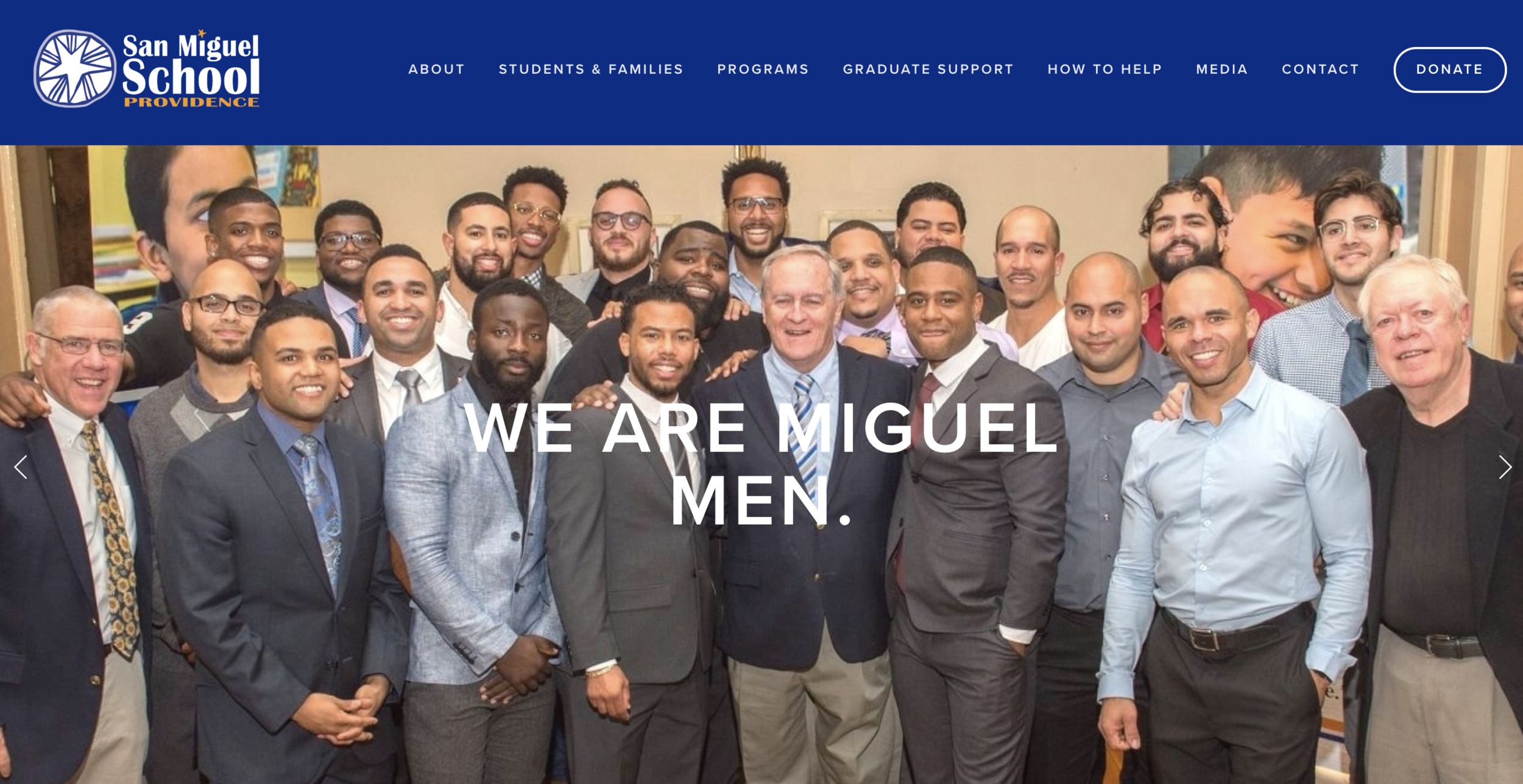
The San Miguel School of Providence
San Miguel School of Providence has an incredible mission: transforming the lives of young men through holistic, values-based education. Our goal with the redesign was to bring the school’s story to life online. We crafted a brighter, more engaging layout, infused with photography that highlights student success, dedicated educators, and community spirit. The site structure was reorganized to serve multiple audiences, making it easier to find information on admissions, support opportunities, and alumni achievements.
The result is a welcoming, mission-forward website that reflects the heart of San Miguel, a place where education opens doors, and every student is seen, supported, and set up to thrive.

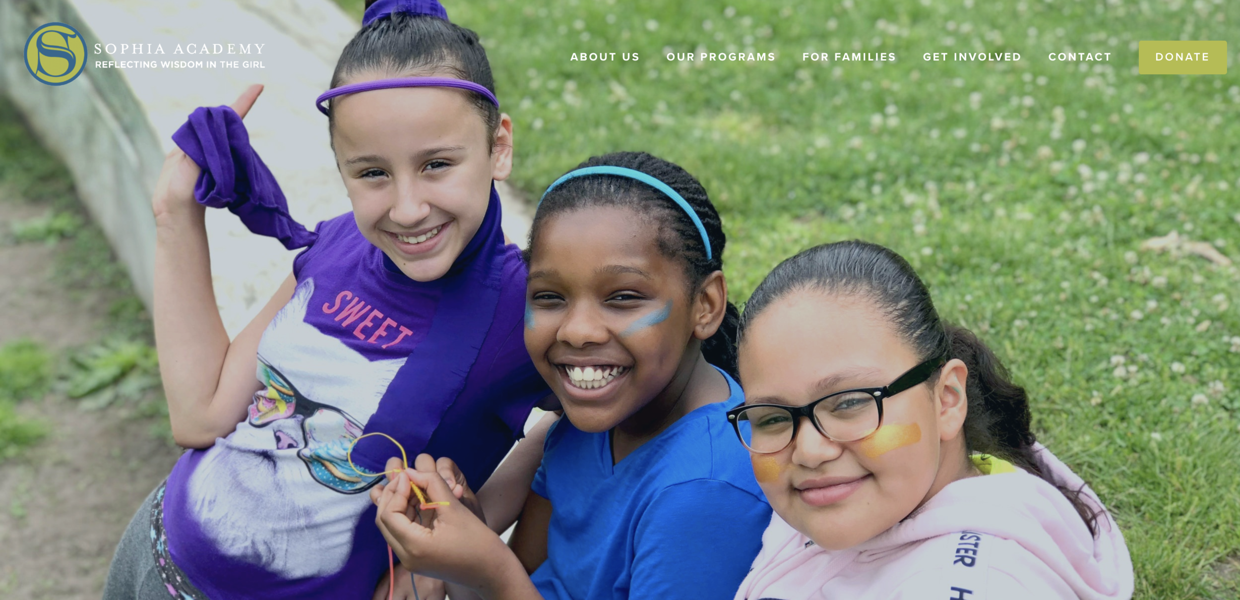
Sophia Academy
Sophia Academy empowers girls from underserved communities in Providence with a transformative, values-driven education. In redesigning the site, we focused on amplifying the voices and vision behind Sophia. We brought in vibrant photography, uplifting design elements, and a clearer site structure tailored to families, supporters, and prospective students. Key messaging was refined to highlight Sophia’s commitment to equity, academic excellence, and personal growth.
The result is a dynamic, mission-centered website that reflects the power of a Sophia education, a space where young women are seen, supported, and inspired to lead.